Once installed, solar panels silently go about producing power for your home. With little to no maintenance required, it’s easy to forget they’re up there.
But something happens after a solar installation that we call the solar effect.
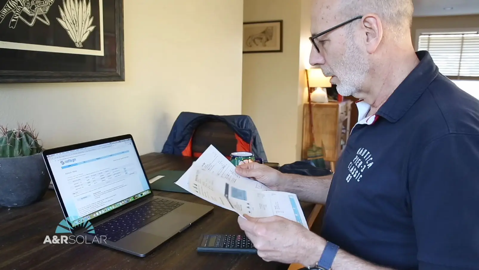
Homeowners become invested in their energy production, and naturally, start monitoring their energy usage. They read their electricity bills more thoroughly, paying close attention to how much energy they consume.
More importantly, homeowners start paying attention to how much power their solar panels produce, which is accomplished with an inverter and solar monitoring software.
With solar monitoring software, customers are presented with useful information about solar energy production and home energy consumption patterns. With this data, homeowners can optimize the overall efficiency of their solar investment and tailor their energy usage to maximize solar energy production.
QUICK LINKS
What is solar monitoring?
SolarEdge Monitoring
Enphase solar monitoring
What is solar monitoring?
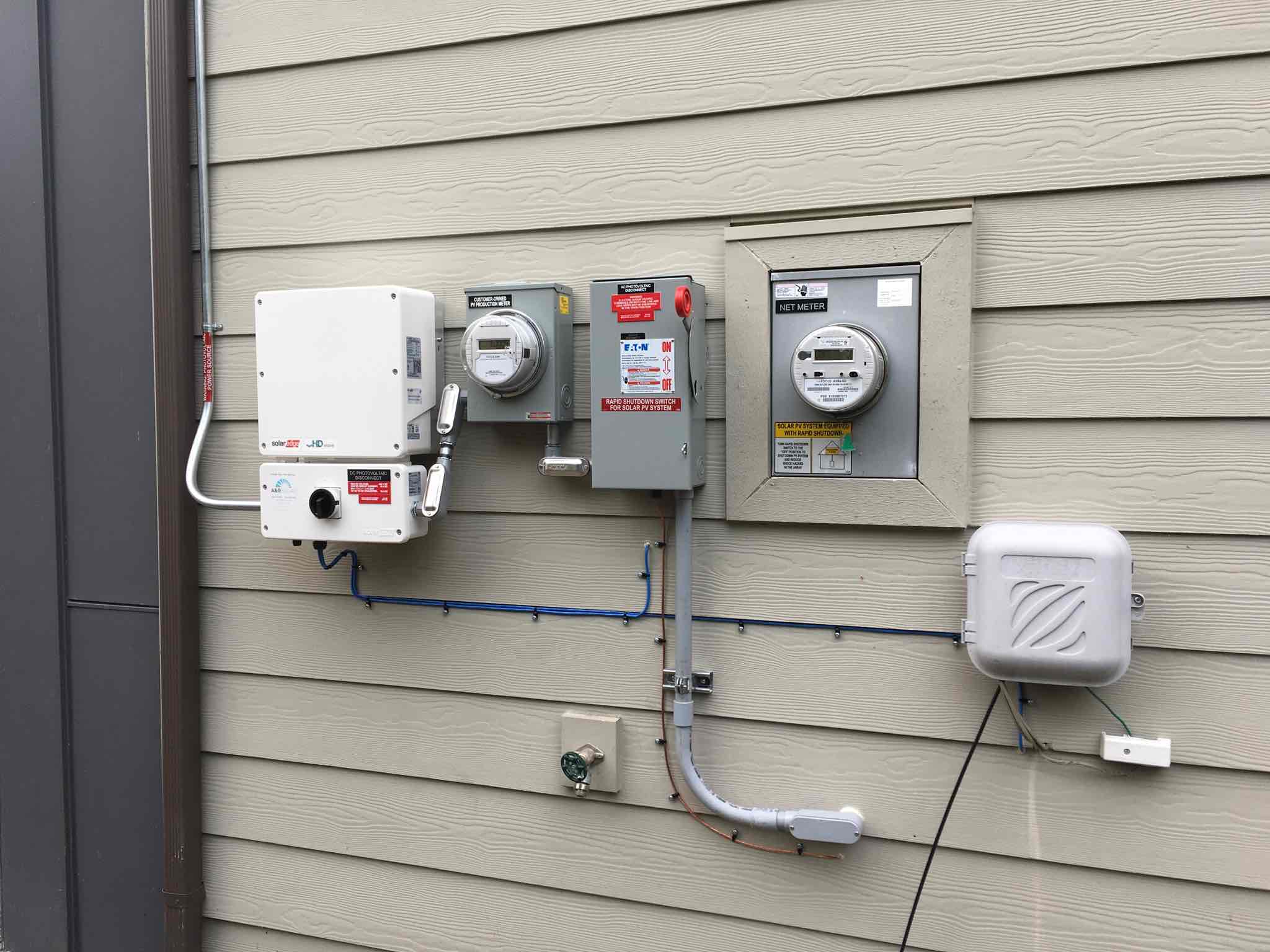
Solar monitoring is the process of tracking and analyzing solar panel performance with data provided by a solar inverter. Depending on the inverter, data is transmitted to monitoring software via Wi-Fi or a modem and internet connection.
After a solar installation, an A&R associate will set up each monitoring platform (mobile app and web portal), as well as help create login credentials so homeowners can access information about power output, track power imported and exported to the grid, as well as monitor module-level performance.
Data can be displayed in a variety of useful graphs and visualizations that help users and our service team identify issues that may require additional service.
While a variety of solar inverter manufacturers exist, A&R has identified two that perform best in our Northwest climate.
SolarEdge optimized string inverters
Enphase microinverters
SolarEdge Monitoring
SolarEdge Power optimizers attached to each solar panel are paired with a central string inverter and allow for module-level monitoring via the SolarEdge app and web portal.
Homeowners will have the option of connecting their SolarEdge inverter to the web via Wi-Fi or a direct connection between the inverter and a modem.
From the mySolarEdge app and web portal, homeowners can access information on overall energy production, system efficiency, and the amount of power exported to the grid, along with other system insights.
For more detailed information on a SolarEdge system, it’s best to monitor solar performance via the web portal.
Within the dashboard, users will be presented with the current power being produced in Watts, energy generated today presented in Kilowatt-hours (kWh), energy this month in kWh, and lifetime energy (typically in Megawatt-hours if your system has been producing for a while).
Below these high-level metrics, users are presented with a production graph that displays data on how a system has been performing throughout the day, week, month, year, and within a billing cycle.
Upon hovering over the graph, users can explore data points in more detail within the selected time frame.
Users will also be able to compare current system performance in a month-by-month, quarterly and yearly comparison.
Layout tab
For more granular analysis, the layout tab presents data on each panel. Hovering over any one panel will present users with metrics on that panel’s performance, which is helpful in identifying issues as well as understanding system efficiency.
Within the layout tab, users can visualize how their system has been performing throughout the day by selecting the “show playback” view. Users will be presented with a graph wherein the x-axis represents the time of day. By dragging the cursor along the graph, homeowners will be shown per-panel performance throughout the day which provides valuable information on system trends.
Charts tab
Within the charts tab, users can download data pertaining to AC current, AC power, energy from grid, AC energy, AC voltage, power from the grid, AC frequency, and DC voltage. Used more as a troubleshooting tool, these metrics are valuable in understanding how a solar energy system operates as well as how it interacts with the grid.
Alerts tab
If an issue occurs with a solar energy system, notifications can be scrutinized within the alerts tab.
Typical alerts would be that a system is not communicating with the internet or an inverter or optimizer is not producing. If that’s the case, then it’s important to notify A&R Solar so we can assess the issue and work to resolve it.
Admin tab
Within the admin tab, users can access and change information about their system including:
Site details: Edit site parameters such as location, feed-in tariff, display options, API, etc.
Site access: Configure the revenue calculation for a site.
Revenue: The revenue value is an estimation of the expected revenues and may be used as an indication of the system’s ROI (return on investment). The revenue calculation is based on time periods and their corresponding rates and on periodic reporting from the SolarEdge inverter.
Logical layout: The Logical Layout tab in the Admin window displays the list of components in the site. This tab allows adding new inverters or Control & Communication Gateways (CCG), and updating replaced components (inverters, power optimizers, CCGs and SMIs) in the monitoring portal.
Physical layout: The physical layout of the PV system gives a bird’s eye view of the actual placement of each component in the site (inverters, modules, etc.). Mapping the physical location of each component in the site is not mandatory, however makes site diagnostics easier and more informative.
Enphase solar monitoring
Enphase microinverter systems are monitored via a central gateway device called the Envoy, which collects and sends system data to the Enphase Enlighten app and online web portal. The Envoy can connect to the internet via a Wi-Fi connection, an ethernet cable connecting the gateway directly to a modem, or a cellular data plan.
The My Enlighten web portal provides the most comprehensive overview of your solar energy system. With it, homeowners can monitor performance with virtual displays that show daily reporting data, as well as historical performance.
Within the overview tab, homeowners can quickly see their system’s kilowatt hours produced, peak power in kilowatts (the highest amount of power produced at any one moment during the day), and latest power, which refers to how much power was produced in the most recent 15-minute reporting interval.
Displayed to the right, homeowners will be presented with individual panel performance, as indicated by a color gradient. The lighter the blue color, the more efficient the panel, while a darker blue color indicates lower performance.
With data provided in this interface, homeowners can identify issues with each panel and take action by reporting any issue to their solar installer.
For a more accurate assessment of panel production, a graph below the panel layout shows panel performance throughout the day, providing a more granular view of panel production in 15-minute increments.
In addition to the overview tab, the production tab provides in-depth data for every day your system has been producing power. Homeowners will be able to analyze solar system performance in hours, days, or months.
Data can be visualized in a grid format where each square represents performance data within 15-minute intervals. In this format, lighter-colored squares indicate higher power production, while darker squares indicate lower production.
Users will also have the option of visualizing data in a bar graph format, which provides a better look at how much power your system was producing in relation to the time of day.
Enphase customers will also have the option of exporting their data to be analyzed in other software applications, allowing for the creation of customized reports that can be shared with their solar installer.